Banana republic with Fairwinds
Building Banana Republic Factory Canada's Online Store
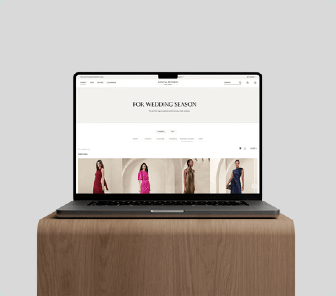
Context
A Market That Needed an Improved Digital Presence
Fairwinds is a boutique agency that works with retail brands in the luxury space. At Fairwinds, I had the privilege of reimagining the new experience for the Fashion and Factory website for Banana Republic US & Canada.
Banana Republic operates at the intersection of accessible luxury and mass retail. While the US Factory experience existed, Banana Republic Canada did not yet have a dedicated site, creating both risk and opportunity.
This allowed the team to define a distinct yet brand-aligned Canadian digital presence, modernize the Factory experience for a value-driven audience, and establish scalable UI patterns for future international growth.
Business Problem
Where the experience was breaking down
01
Inconsistent UI patterns across pages
02
Limited scalability for future features and markets
03
Friction in collaboration between design and development
04
Missed opportunities to elevate discovery and conversion on PLPs
Role
Designing the building blocks
I collaborated with a group of four other designers, each responsible for different aspects of the page. As a Product and Experience Designer, my focus was on the components that users interact with most.
Challenge
Modern experience, no existing system
The core challenge was twofold: create a modern, intuitive shopping experience aligned with Banana Republic's evolving brand vision, and design for scale despite the absence of an existing design system.
This required balancing visual refinement with structural rigor, ensuring the experience could grow without rework.
Design Principles
Guiding the system
PLP Design
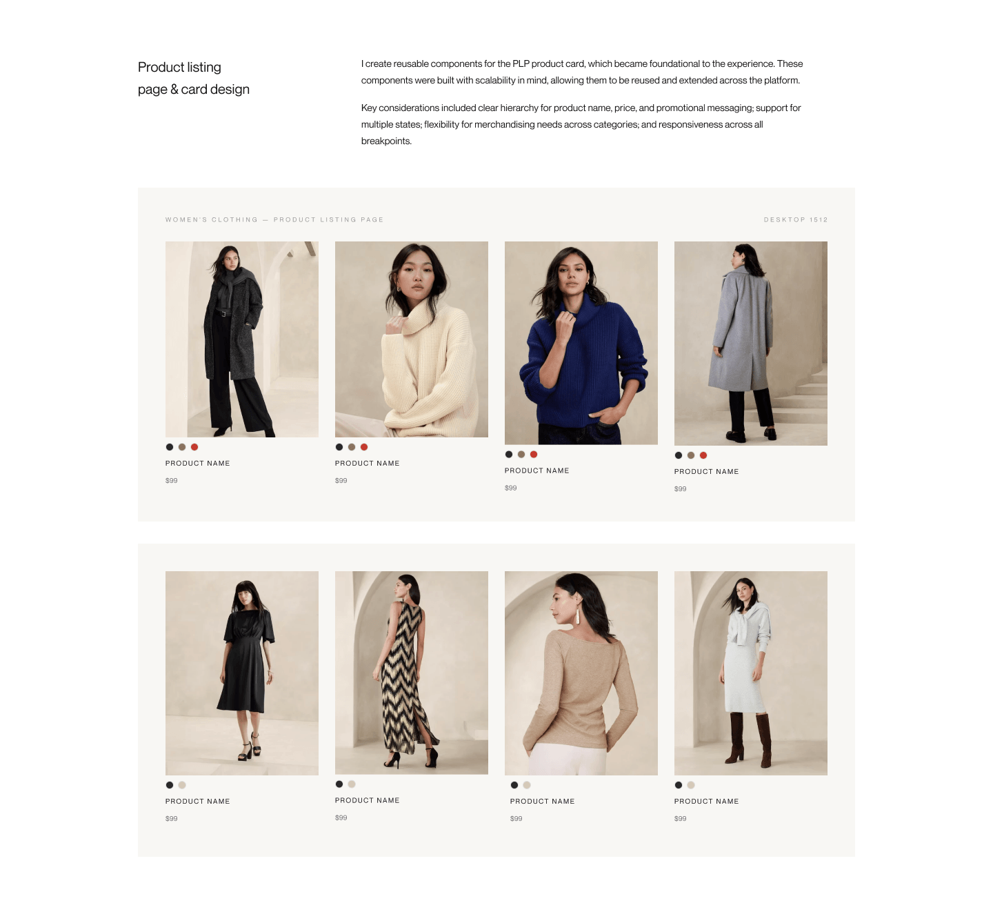
Product listing page & card design
I create reusable components for the PLP product card, which became foundational to the experience. These components were built with scalability in mind, allowing them to be reused and extended across the platform.
Key considerations included clear hierarchy for product name, price, and promotional messaging; support for multiple states; flexibility for merchandising needs across categories; and responsiveness across all breakpoints.
System
Scaling the Design System
At the start of the project, a robust design system did not exist. I worked closely with the design team and a design systems consultant to create reusable components and variants in Figma.
This work improved consistency and reduced ambiguity for both designers and developers. We defined states, sizing rules, icon usage, naming conventions, and documentation.
Quick Look Panel

Component Architecture
Color & Filter System
Discovery
Shopping by Occasion, Not Category
Beyond transactional shopping, I explored how editorial storytelling could enhance engagement. The Lookbook was reimagined as a discovery and inspiration layer, emphasizing visual storytelling tied to real product pathways.
We explored shopping by occasion as an alternative mental model to categories, reducing cognitive load while preserving choice. Intuitive filtering supported faster decision-making across the experience.
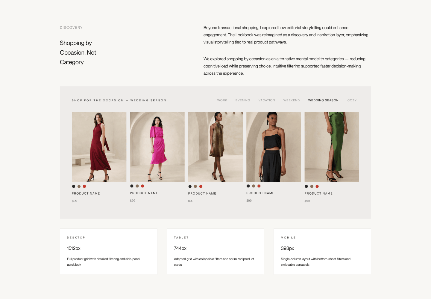
Desktop
1512px
Full product grid with detailed filtering and side-panel quick look
Tablet
744px
Adapted grid with collapsible filters and optimized product cards
Mobile
393px
Single-column layout with bottom-sheet filters and swipeable carousels
Impact & Reflection
A platform Built to Evolve
The system-led approach positioned the platform to evolve without constant redesign.
- Scalable PLP foundations: reusable product card and listing components
- Stronger collaboration: reduced design-development friction
- Cross-breakpoint consistency: unified experience across desktop, tablet, mobile
- Market-ready launch: Banana Republic Canada digital presence
Success Indicators
- Improved product discoverability and scanability on PLPs
- Clearer merchandising hierarchy for price, promotions, and availability
- Faster iteration enabled by shared components and standards
- Consistency of UI across breakpoints and surfaces
- Reduction in design-development friction through documented systems
What I Carried Forward
- Design systems are force multipliers: investment in a robust system accelerates every surface
- PLPs are revenue surfaces: hierarchy, density, and interaction matter
- Collaboration is essential when building from scratch
- Editorial and commerce belong together when designed intentionally